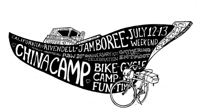
My friends in the Rivendell Owners Group (Bunch? I don’t know) are putting on a shindig in July. Rivendell Bicycle Works is 20 years old this year, which is pretty cool. I remember when “Ever Since 1994” was funny, because it was like… 3 years or something.
I volunteered to make a poster, because I don’t enjoy calling and planning and pestering in order to make an event actually happen. I’m not even sure if I volunteered… I kind of just did it.
The next step, apparently, is to turn the art into some form of permanent commodity: poster, tee shirt, bandanna, etc.
So: which style, and what should we make?
The first pen outline has its proponents on Flickr.

The watercolor version is about 5% more chromatically amped up than it is in person. I enjoyed filling in the color, especially the red/green at the bottom. Two layers of scumbled color. Definitely the most work in this one, but if it isn’t as satisfying… oh well. 
The black block print one is the au courant style I was imagining from the get-go. I like it as a graphic. Also easiest to print.

Leave a Reply