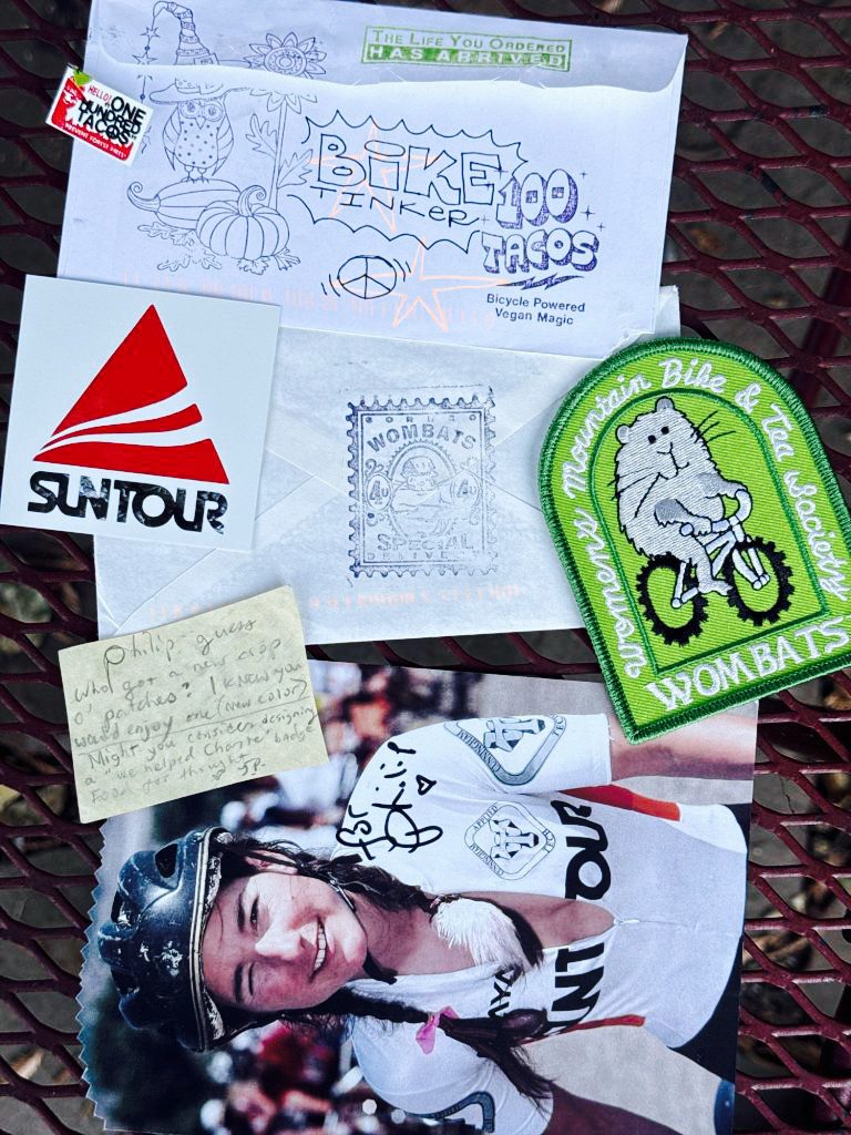
My friends were like, “is this a NORMAL mail day at the Biketinker house?”
No, it’s pretty superlative. 100 Tacos shiny Suntour sticker, Jacquie Phelan postcard AND a mini-letter with a new green Wombats patch!
My friends were like, “is this a NORMAL mail day at the Biketinker house?”
No, it’s pretty superlative. 100 Tacos shiny Suntour sticker, Jacquie Phelan postcard AND a mini-letter with a new green Wombats patch!
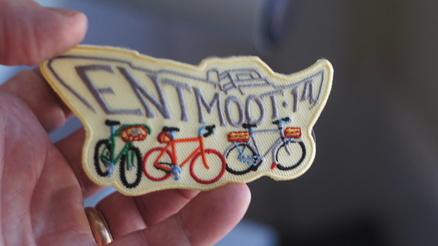
Every Bay Area Rivendell Rider who mailed me an SASE* from Canyon, CA (a place fighting to keep its post office) last Sunday got a free Entmoot patch. A bike drawing was worth extra points, but was not required.
These are the outgoing patches, with the incoming envelopes.
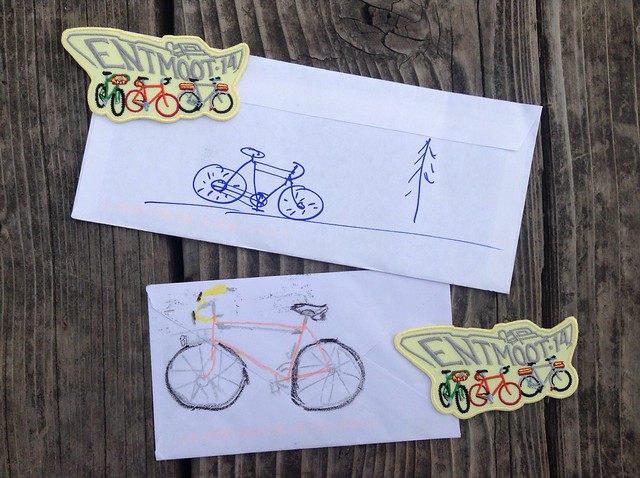
Cool stamps were also worth points.
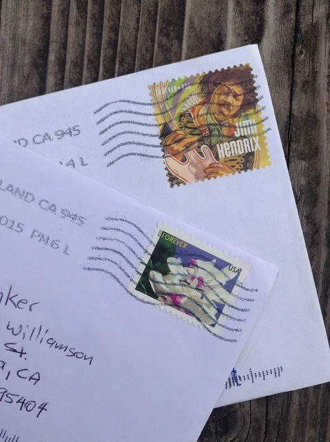
*Self Addressed Stamped Envelope. From the old days. You buy two stamps, and two envelopes. On one envelope, you write your own address, affix a stamp, fold it in half, and put it into the second envelope, which you mail. Someone puts something in the first envelope, and mails it back to you.

I got the shirts on Wednesday, and the patches arrived today!

They look BETTER than expected.
Now’s the moment of reckoning, where goods get matched to orders, and the shipping labels get printed.

I only have about 5 patches to take to the Entmoot itself, and a couple of those are spoken for already. The Patch Hoarders will be able to flip their extras sometime next week…

My old friend, inspiration, and mentor* Sheldon Brown, states that a “Mixte” is a ladies’ style of bike characterized by twin top tubes that extend all the way to the rear dropouts. He further states that there is a variant with a single top tube and the extra set of stays. He says if it don’t have three sets of stays, it ain’t no mixte.
I have always been leery of this interesting pedantic fact, because:
His main point was “don’t use the word mixte to refer to any old ladies’ frame bike,” because it’s a specific style.” I generally skirted** the issue: I tried not to make any embarrassing gaffes, but didn’t correct people on the internet.
Cut to the big mixte news this week on the iBOB list: Greg Reiche posted a link to a C. S. Hiroshi page about creating a ladies bicyle, specifically a “Sport.” One of the pictures showed a publication from FNCRM (Fédération Nationale du Commerce et de la Réparation du Cycle et Motocycle), a French bicycle and motorcycle trade group. Another image was of a page of that publication, showing some of the different styles of step-through frames.
I’ve redrawn the graphic here. Don’t sue me, bro.  Mixte – Twin tubes from the upper head lug all the way to the rear dropouts. Hot.
Sport – A single top tube, with a third set of stays. Also hot. Rivendell and J.P. Weigle style. Sheldon calls this a kind of Mixte.
Berceau – Bendy twin top tubes, for more standover height. Lots of potential, but I’ve never seen a truly sexy implementation of this style.
Jumele – Twin top tubes, with NO third set of stays. I have never seen this style of bike. Doofy.
Anglais – Second top tube, no extra stays. Angelina’s Steyr was this style. Workmanlike.
Col de Cygne – Swoopy top tube, with supporting struts to the down tube. Nice, but tend to look heavy.
Double Col de Cygne – Swoopy top tube, and down tube, with struts. Trying too hard?
Of bikes that have passed through my house, apparently the Steyr was a “style Anglais,” while the Belleville is a true mixte. The couple Suburbans Angelina had were… variations on the Anglais?
* Internet-style. He may or may not have recognized me on the street. ** See what I did there?

I have the Rivendell jamboree tee shirt design up on Etsy. Three colors of bicycle: Rivish green, blue or orange. So far orange is the front-runner, but the blue is my favorite.


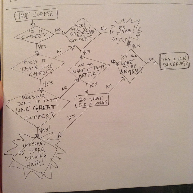
I thought this up while riding my bike. I think it applies to anything that people might obsess over.
Coffee is pass/fail. “Does it taste like coffee?” Good. Does it taste like great coffee? Great!
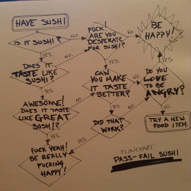
for me, sushi is pass/fail.
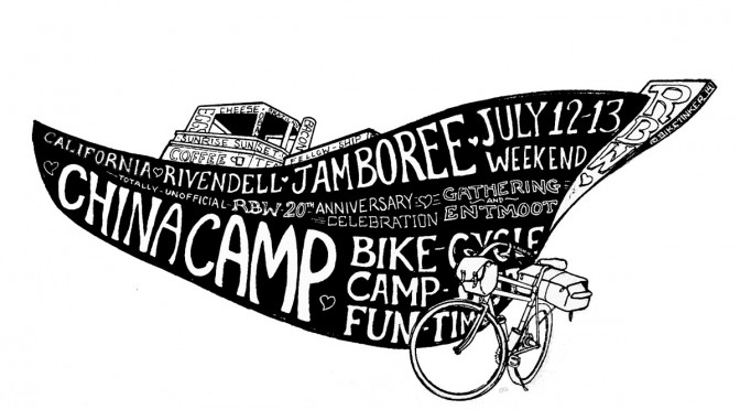
My friends in the Rivendell Owners Group (Bunch? I don’t know) are putting on a shindig in July. Rivendell Bicycle Works is 20 years old this year, which is pretty cool. I remember when “Ever Since 1994” was funny, because it was like… 3 years or something.
I volunteered to make a poster, because I don’t enjoy calling and planning and pestering in order to make an event actually happen. I’m not even sure if I volunteered… I kind of just did it.
The next step, apparently, is to turn the art into some form of permanent commodity: poster, tee shirt, bandanna, etc.
So: which style, and what should we make?
The first pen outline has its proponents on Flickr.

The watercolor version is about 5% more chromatically amped up than it is in person. I enjoyed filling in the color, especially the red/green at the bottom. Two layers of scumbled color. Definitely the most work in this one, but if it isn’t as satisfying… oh well. 
The black block print one is the au courant style I was imagining from the get-go. I like it as a graphic. Also easiest to print.


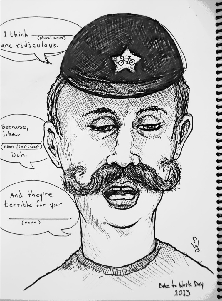
“I think fixies are ridiculous. Because, like, brakes. Duh. And they’re terrible for your knees.”


I did my 36 mile commute a couple times last week, and found myself wondering why longer commutes aren’t run with fendered Time Trial bikes. This is my take on a stock TT bike, with fat 650B tires, fenders, and luggage (a Revelate-style seat bag and custom front trunk). Oh yeah, it also has lights, a fixed gear and a chain guard.

 Sharon Eisely painting, originally uploaded by BikeTinker.
My friend Sharon is a fantastic painter. This was on display at some kind of Bike Moustache Rides expo for withered hipsters held in a parking garage. It was the only thing that didn’t make me feel uncomfortable, and it’s pretty weird.


I talked to the creator of this bike (Herr Doktor Frankenstein, I believe), and really want to see his studio. Each of the different colors shows that piece is from a different bike. Except red – all the red pieces are from different bikes, too.
You sit on the seat, put your feet on the pedals, and I believe the bars are under the helmet. The whole front end turns, like a pennyfarthing. There’s a “floating chainwheel” in the chain as a tensioner. Cool. He says he goes out to the dump and buys a pickup load of bikes to cut up for these rolling sculptures. “$10 or $20, depending on what they have.”
The builder said he considered a second drivetrain to the rear, and a second seat, but thought that was too crazy. I’d kind of like him to look at my “hinge-in-the-middle” tandem design…
There were a couple of other “small wheel, high-saddle” bikes at the Bike Expo. Chain-drive ordinaries, of a sort. I complimented one of the guys on his bike, and he just gave me the barest nod of acknowledgement. Classy.
This other guy seemed genuine and cool. Plus his bike was nicer.

If you’re in Portland, you should go see Adam Haynes’ drawings this Friday.

These are from the Nike 6.0 illustrations he did… backtrack*: Adam is a fantastic illustrator. He just did a Dirt Rag table of contents illustration, and rumor has it that he’s going to do a cover. His style is intricate black keyline over flat color – realistic, detailed, something like Geoff Darrow, except you feel good after looking at his work.
He also illustrated the labels for Deschutes‘ “Red Chair” NWPA.
And… he did an Imperial Shit Ton of drawings for Nike. I think he scans the ink drawings, and the color is added digitally, so this is the first time you can actually see the original drawings. And I love original drawings. I like that they were inked by a real human, and I like seeing where a pencil line was bettered in the inking. I just like it. I think it’s because I was a “good draw-er” before I was ever an artist.
So the show is Friday, August 18, 2012, from 6 to 10, at Nemo Design, on Belmont. Should be a good turnout, even if you don’t go, but still. Go.
*More backtrack – his uncle owns the bike shop in McMinnville.
I bought the Goines poster from Rivendell, and here I am, showing it on the internet.
I took this picture when I got the poster, but Grant had asked that they (Rivendell) be the first to show the poster. Hence, my delay in putting it up. Also, I was busy.


A reader pointed me to some cool bikes built up by a screenprinter as artworks. I really like that approach to bikes, and I really like the bikes themselves. I was a screenprinter* for 8 years, so I have an affinity there, too.

")
My favorite of Jason’s bikes is the Thief of Bagdad bike, which picks up the colors and feeling of the great poster from the movie.
It’s the gold one on the left, with the pale blue rims. I like the blend of fixed gear and BMX going on here, and I think it’s cool he makes them happen.
There are more images here, and a fuller story: Inker Gallery
I got distracted reading about the Thief of Bagdad on wikipedia while stealing this poster image… the original 1924 version stars Douglas Fairbanks, and sounds awesome; the 1940s version stars Sabu, who I’d only ever heard of from the John Prine song. Reading the synopsis of the movie made me think “Wow. Sounds like Aladdin.”
And by the way… oh fuck.
*I can use a stat camera. Can you use a stat camera? I can use a stat camera.

Let’s Share, originally uploaded by the Magnificent Octopus.
Bikin’ and doggin’